ADN Prefabricate.
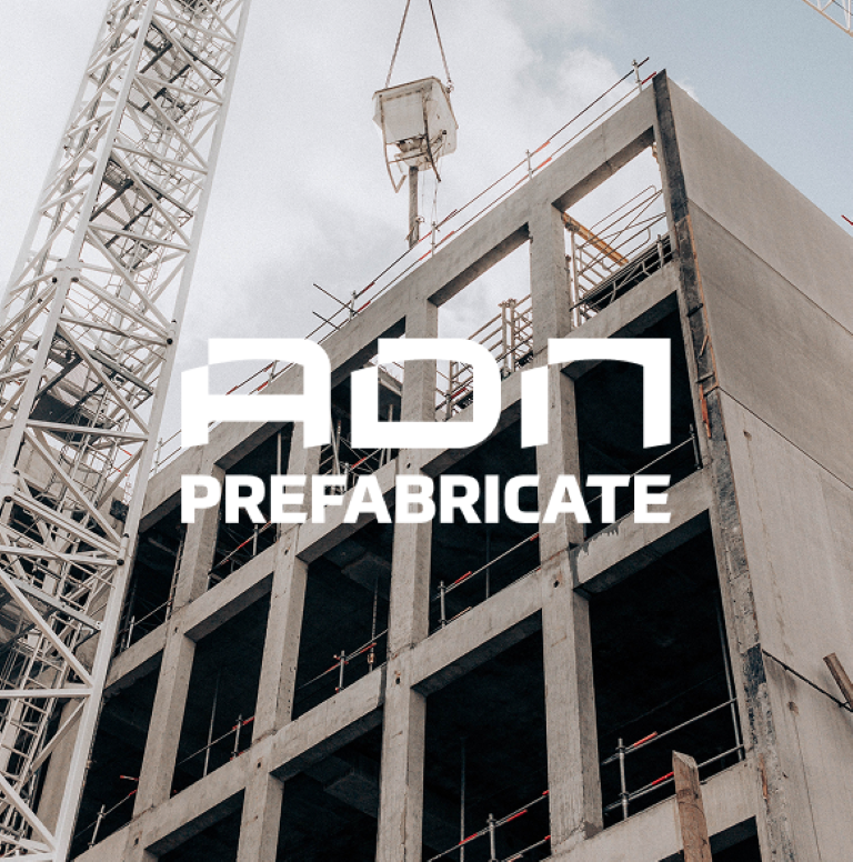
ADN Prefabricate is a Romanian company with over 50 years of experience in producing and delivering high-quality precast concrete solutions.
With a production capacity of 30,000 cubic meters of concrete per year and 7 specialized production lines, the company supplies durable and efficient products for road infrastructure, civil, industrial, and agricultural projects, as well as overhead power line (LEA) poles.
Challenge
The objective was to come up with a visual identity that better represented the core business activities. One of the primary challenges lay in the brand name “ADN PREFABRICATE” which presented minimal symbolic associations for visual interpretation.
Consequently, the strategy focused on leveraging “ADN” as a medium for visual expression, allowing for the development of a cohesive system that complemented the brand’s identity.
What we did
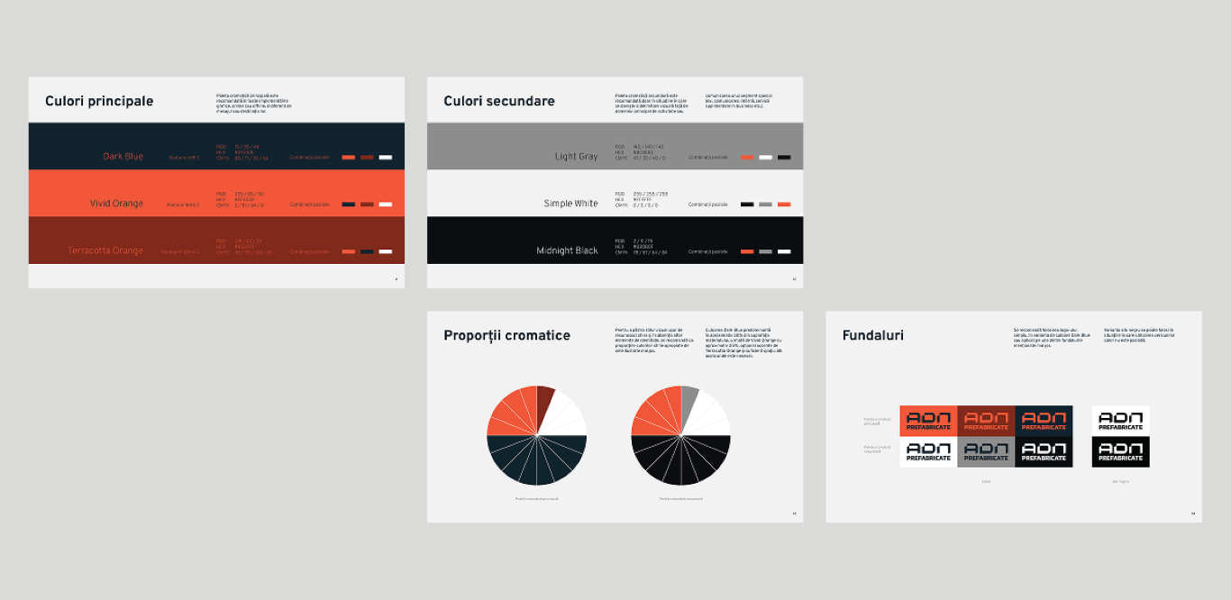
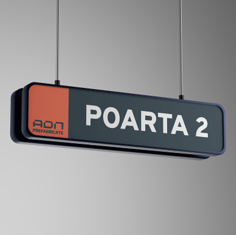
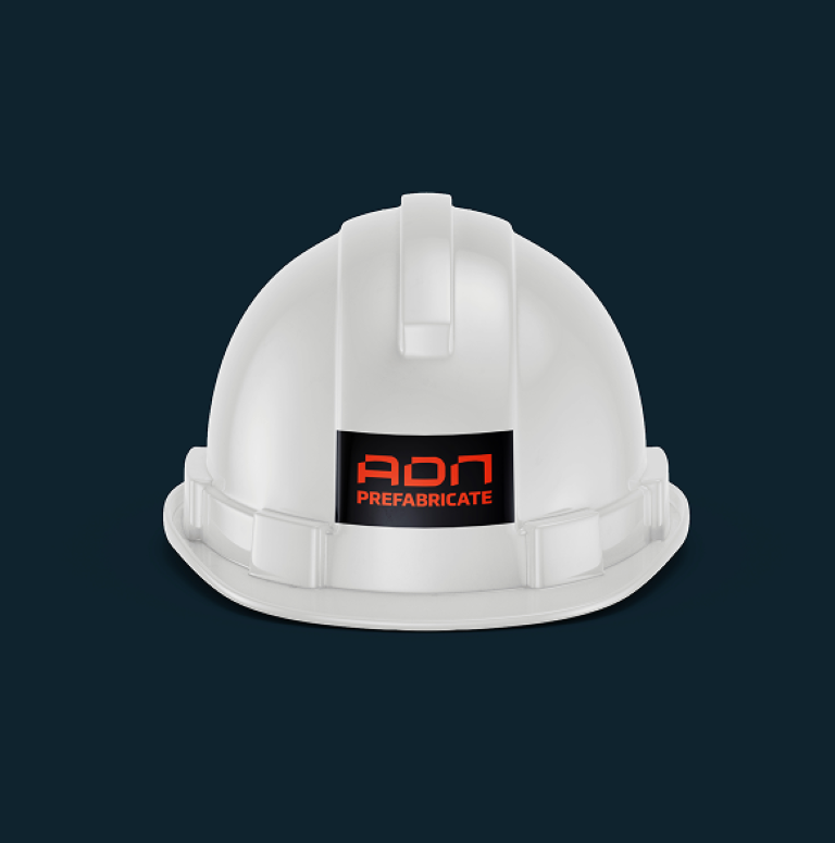
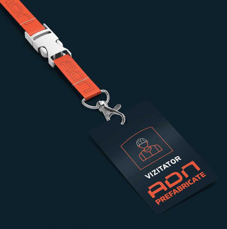
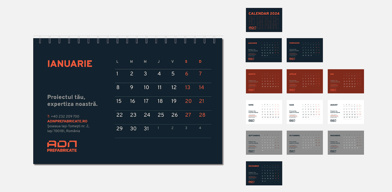
In this rebranding project, Subsign developed the complete visual identity for ADN Prefabricate, creating a distinctive and modern brand system that differentiates the precast concrete division from its parent company.
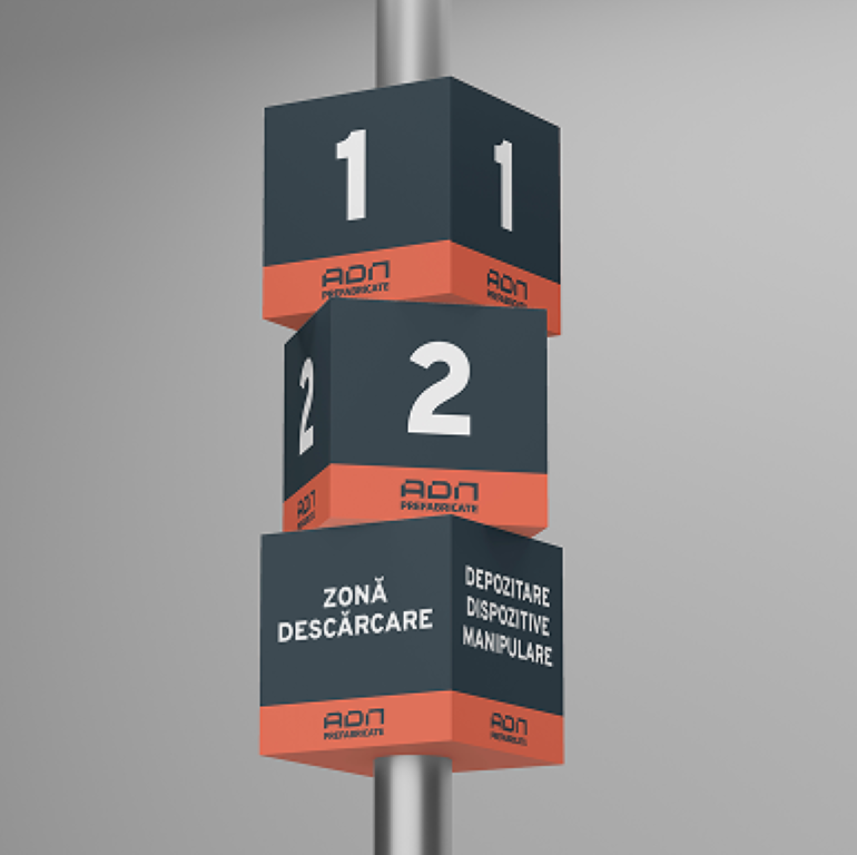
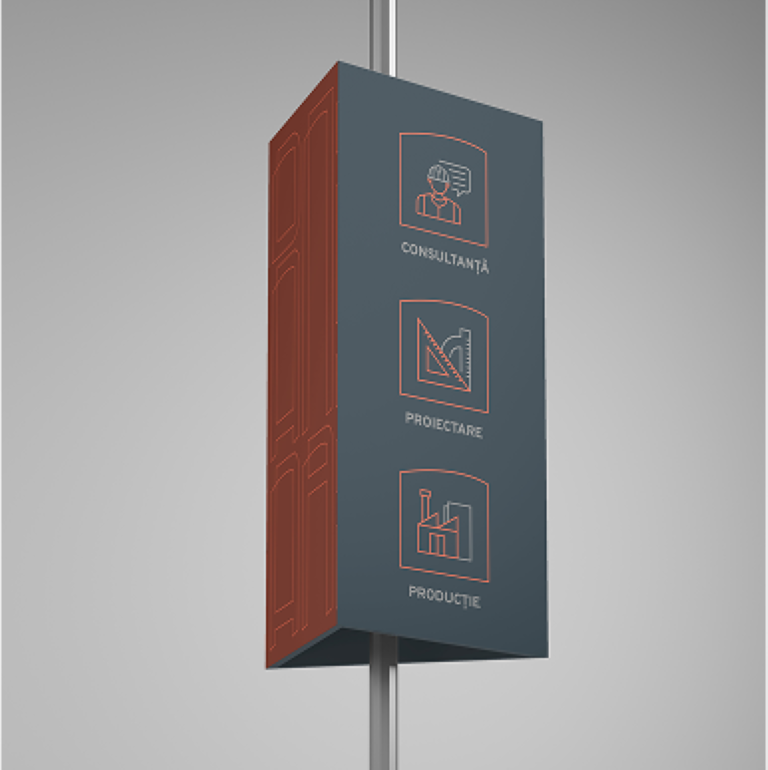
Our work included designing the logo, defining the visual language through custom graphical elements, iconography, and patterns inspired by technical drawings, and ensuring a bold yet functional aesthetic tailored to resonate with a technical audience within the construction industry.
Results
The rebranding was met with positive feedback from both shareholders and company members, who embraced the fresh, modern identity.
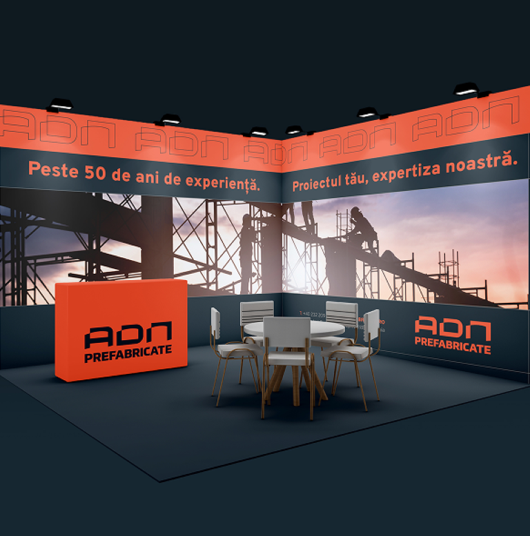
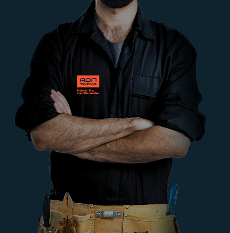
The new visual system was successfully implemented across all channels, enhancing brand recognition and reinforcing ADN Prefabricate’s distinct position in the market.