neen.
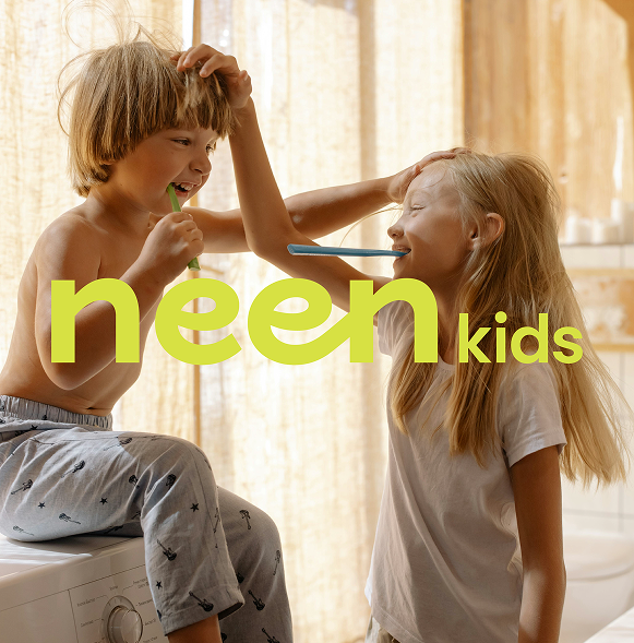
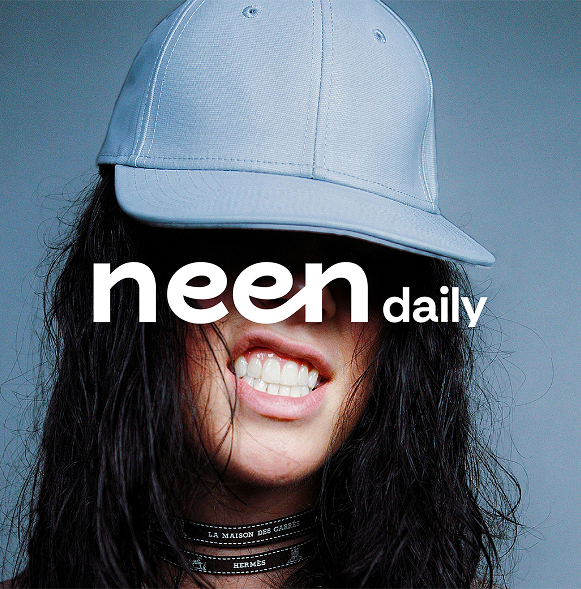
neen is a newly launched oral care brand that brings joy and flavor to daily routines. With its bold product lineup, including fun, non-traditional flavors like watermelon and lemon, along with kids’ pastes and whitening kits. neen challenges the conventional approach to dental hygiene.
At its heart, neen’s mission is simple: to transform brushing from a chore into a delightful ritual for both children and adults.
Challenge
When neen approached us, their vision was ambitious: create an oral care brand that stands out with personality, playfulness, and credibility. They wanted to position themselves as a lifestyle brand rather than a clinical one, something that felt fresh, trustworthy, and fun.
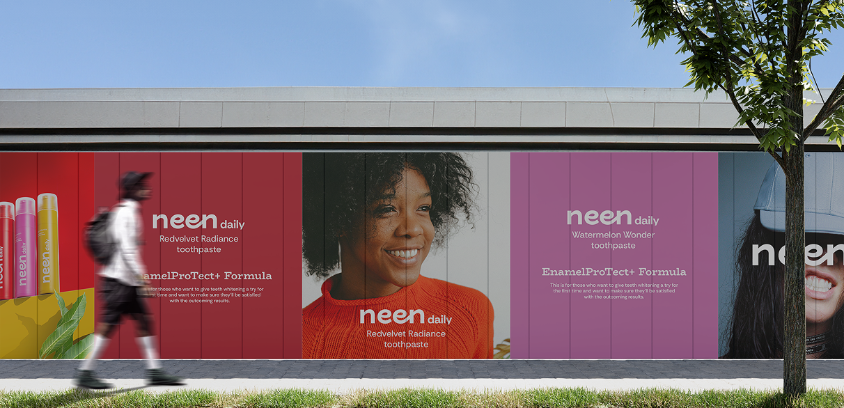
The biggest challenge? Translating this lively concept into a visual identity and digital experience that resonated with kids, reassured parents, and stood tall in a saturated market. We needed to develop a brand presence that could hold its own on a pharmacy shelf and create excitement online.
What we did
To meet the challenge, we anchored every creative decision in neen’s core values: playfulness, scientific trust, and genuine care.
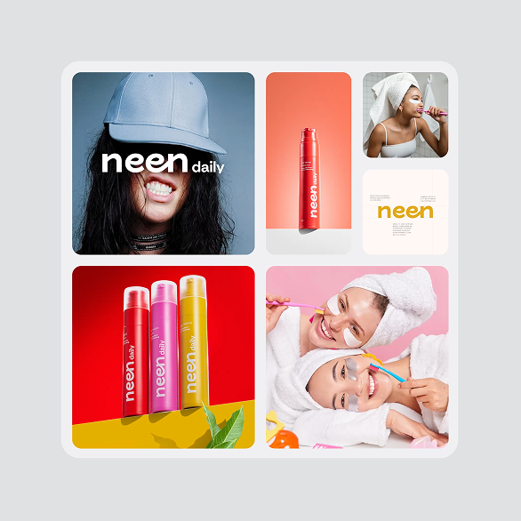
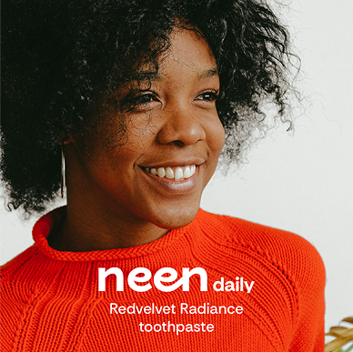
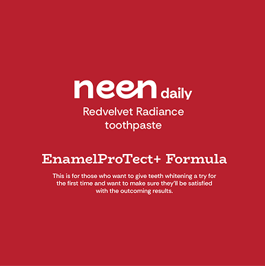
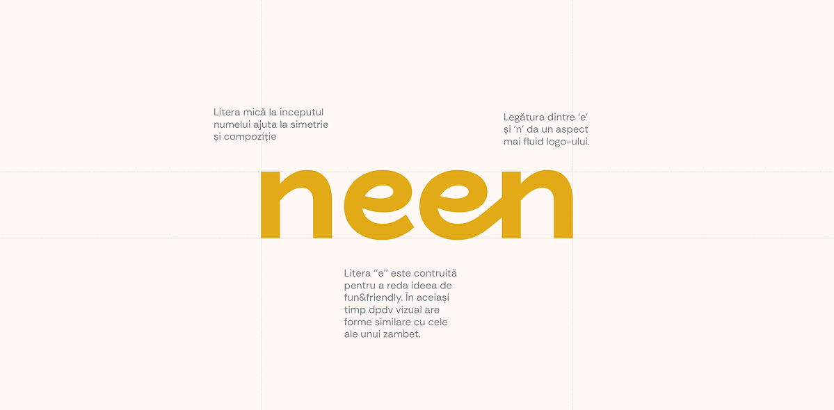
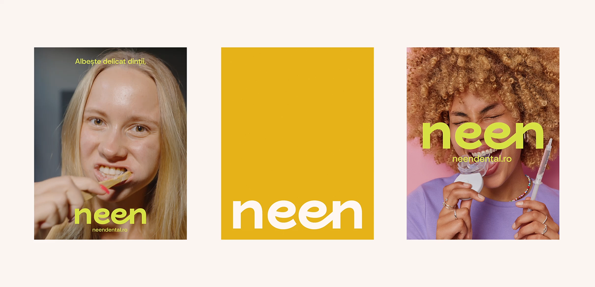
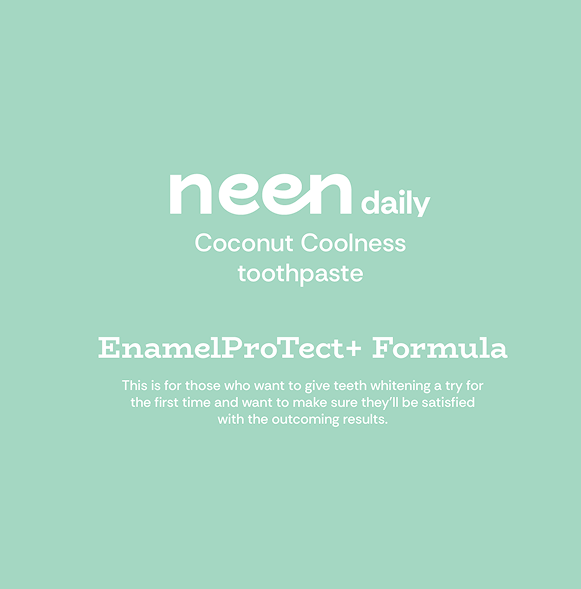
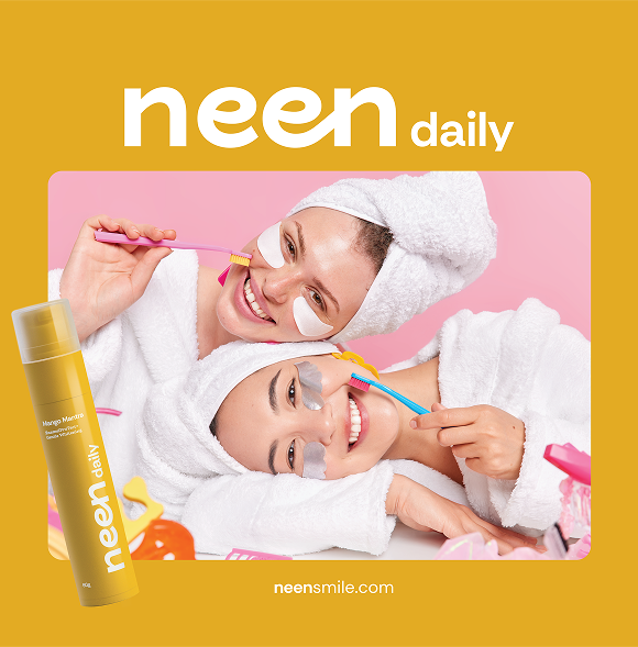
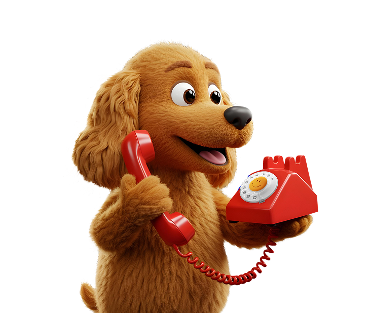
Visual identity: We crafted a bold and joyful visual language. From custom illustrations and a vibrant color palette to dynamic typography, every design element reinforces neen’s upbeat tone and child-friendly focus. The brand feels bright, clean, and confident, never clinical or cold.
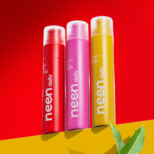
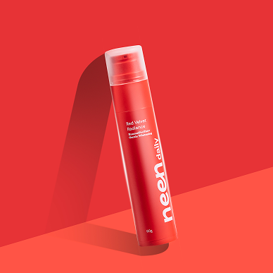
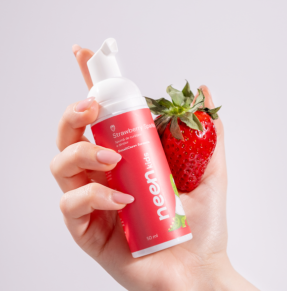
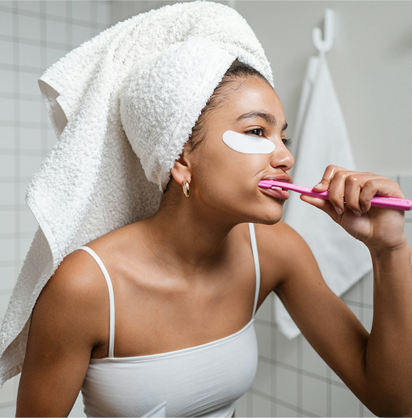
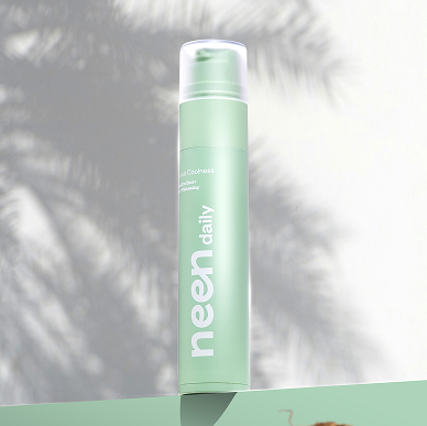
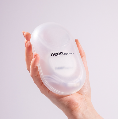
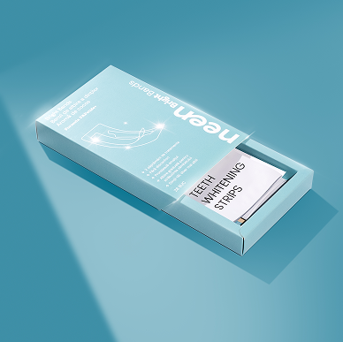
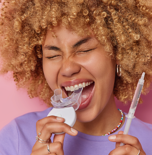
Product photography: Each shoot was designed to capture the energy of the brand. Using playful props, expressive lighting, and color-coded setups, we visually communicated flavor cues and made every image pop with personality.
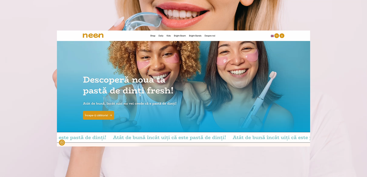
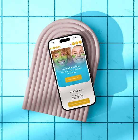
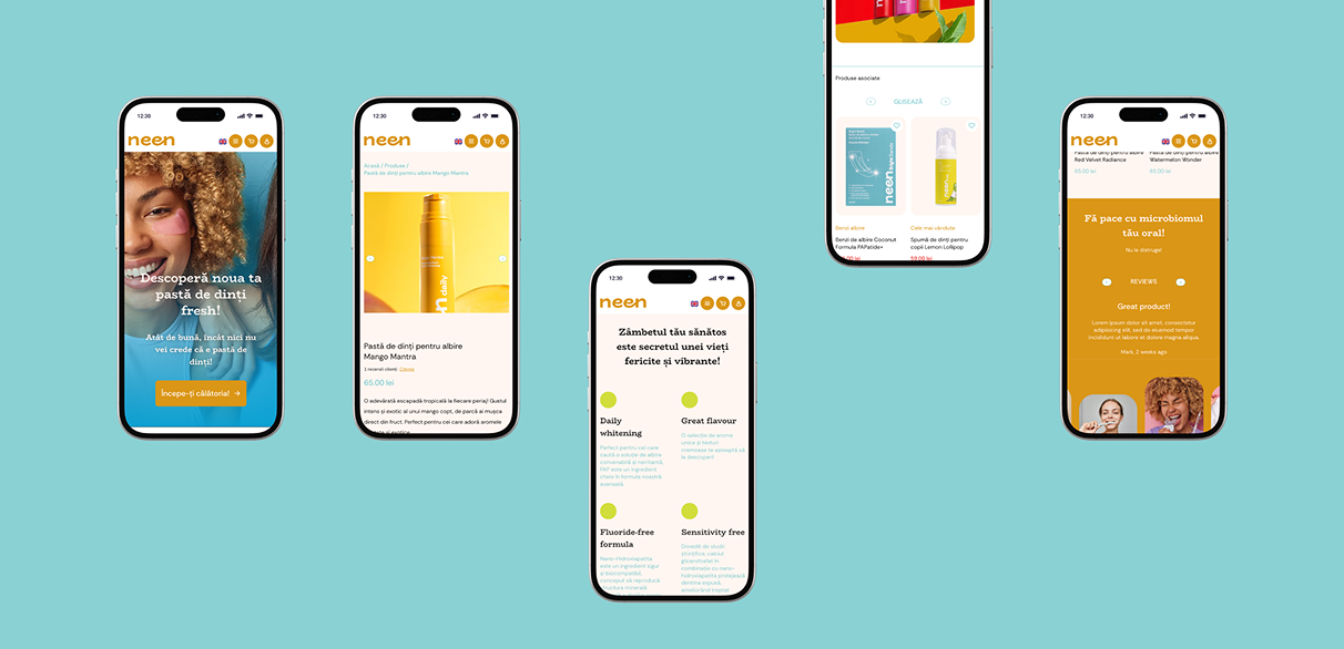
Online shop: We designed & developed a custom WordPress eCommerce experience that felt as fun to browse as the products are to use. With intuitive navigation, interactive flavor guides, and dynamic visuals, we created a seamless online journey from curiosity to checkout.