TGI Term.
TGI Term is a regional company that was founded in 1995 and activates in the construction sector. Their objective is to deliver high standards services with a german quality. They work both B2C and B2B, having a wide range of projects in terms of urban development.
Challenge
The challenge was to address internal and external communication gaps while creating a cohesive brand identity that reflects TGI Term’s reliability, professionalism, and long-standing commitment to quality.
What we did
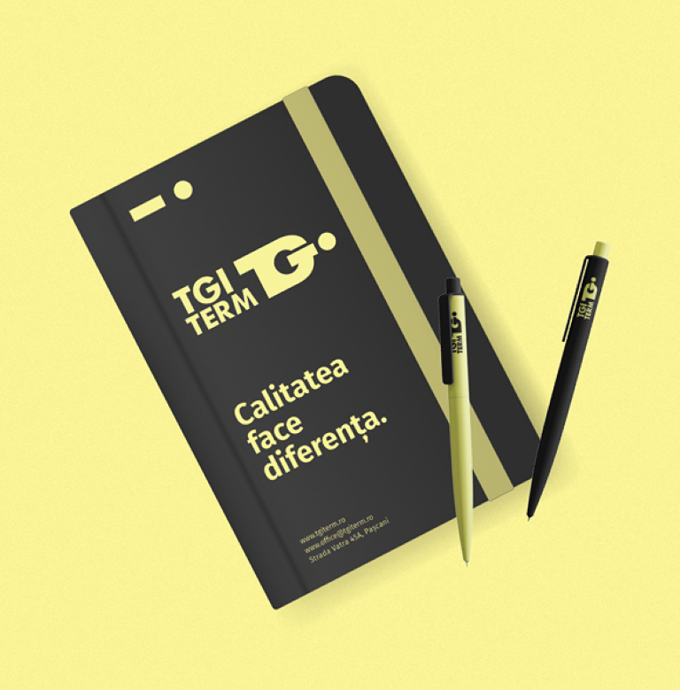
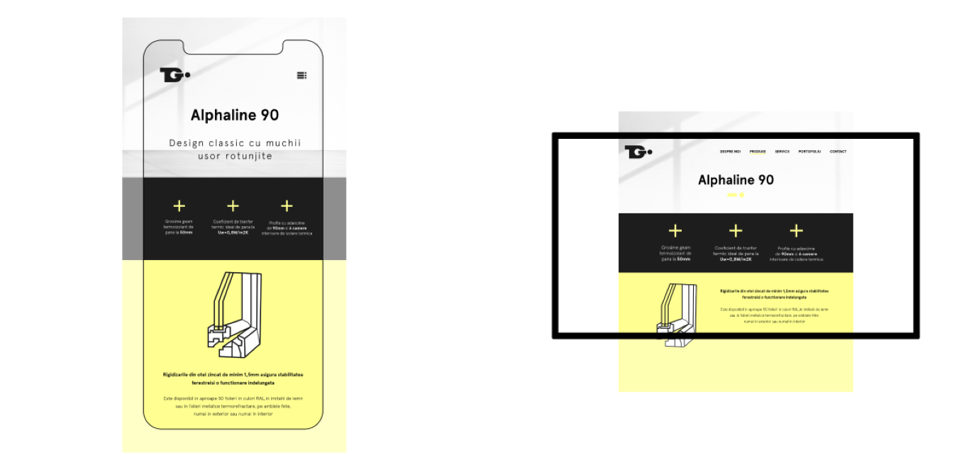
We redefined TGI Term’s brand identity through a creative process involving brainstorming, mood boards, and experimenting with natural, earthy tones alongside technical elements like the distinctive “yellow post-it” highlight.
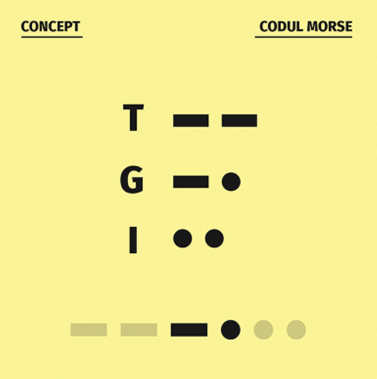
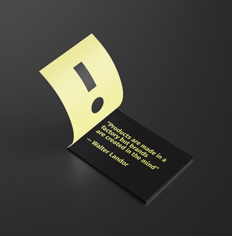
To address communication challenges, we developed a logo inspired by Morse code, embedding a hidden, adaptable message to reflect their flexibility and focus. The new tone of voice is conversational, open, and energetic, with a touch of humor, reinforcing their professionalism and reliability.
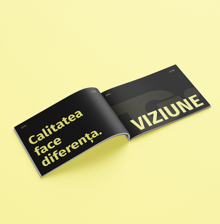
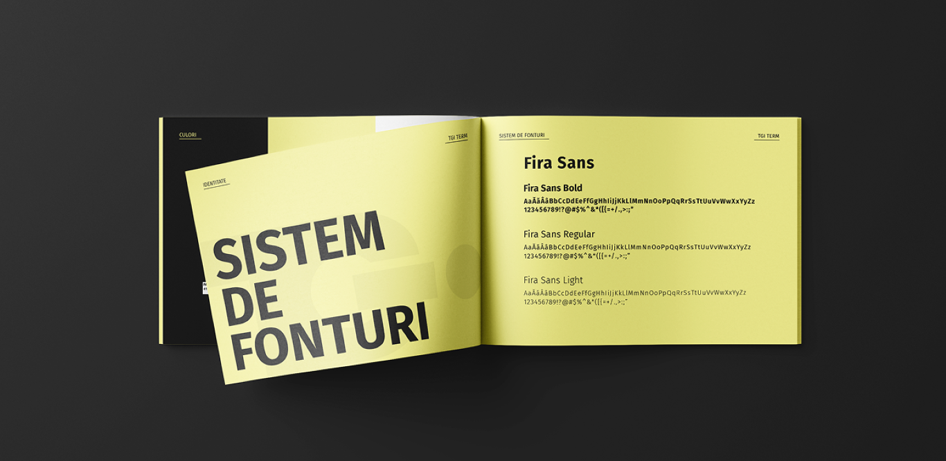
To support long-term brand alignment, we also created a comprehensive brand manual as a guide for future communications and design.
Results
The rebranding successfully positioned TGI Term as a modern, reliable, and professional company, with a bold visual identity and clear communication strategy.
The cohesive brand experience strengthened their market presence, improved internal and external communication, and reinforced their commitment to quality across all touchpoints.